From 2012 - 2023 I lived and worked on the unceded, ancestral territories of the xwməθkʷəy̓əm (Musqueam), Sḵwx̱wú7mesh (Squamish), and səlilwətaɬ (Tsleil-Waututh) Nations. From 2019 - 2020 I had the privilege of working with the Squamish Nation to develop their brand identity while serving as the Creative Lead at hcma.
ABOUT THE PEOPLE
The Squamish Nation are a vibrant, dynamic Coast Salish Nation, with a strong culture, rich history, and bright future. The term Coast Salish refers to a group of ethnically and linguistically related Indigenous peoples, whose traditional grounds are found on the Northwest Pacific Coast. They are connected to each other—and their land—through culture, language, and art.
PROJECT BACKGROUND
For over 45 years, the Squamish Nation had been using the same logo—the Thunderbird—originally commissioned for the Education Department. Without a contemporary logo, or a clear communications style guide, the Nation was struggling to communicate its identity consistently across eleven departments and various marketing mediums.
Additionally, the Nation expressed a few challenges with the existing Thunderbird logo, namely: the loss of detail when scaled smaller; difficulty pairing text with the Thurderbird due to its taller proportions; and the fact that it contains elements of Formline—a design aesthetic commonly associated with Haida, Heiltsuk and Kwakiutl peoples—which doesn't accurately reflect Coast Salish design.
A few examples of the Department logos before the rebrand
Moreover, the Nation and its departments had no formal wordmark or rules defining whether English should be placed above or below the Squamish language. It was time for a refresh: a culturally-relevant, contemporary visual brand representative of the Nation’s identity within a modern world.
DESIGN PROCESS: LOGOMARK
Following a series of stakeholder workshops, and in-depth research into Coast Salish culture, exploration on the identity began. Understanding that the Thunderbird held great cultural significance with its members, a solution was reached that would solve the challenges presented while providing an opportunity for future Coast Salish design enhancements.
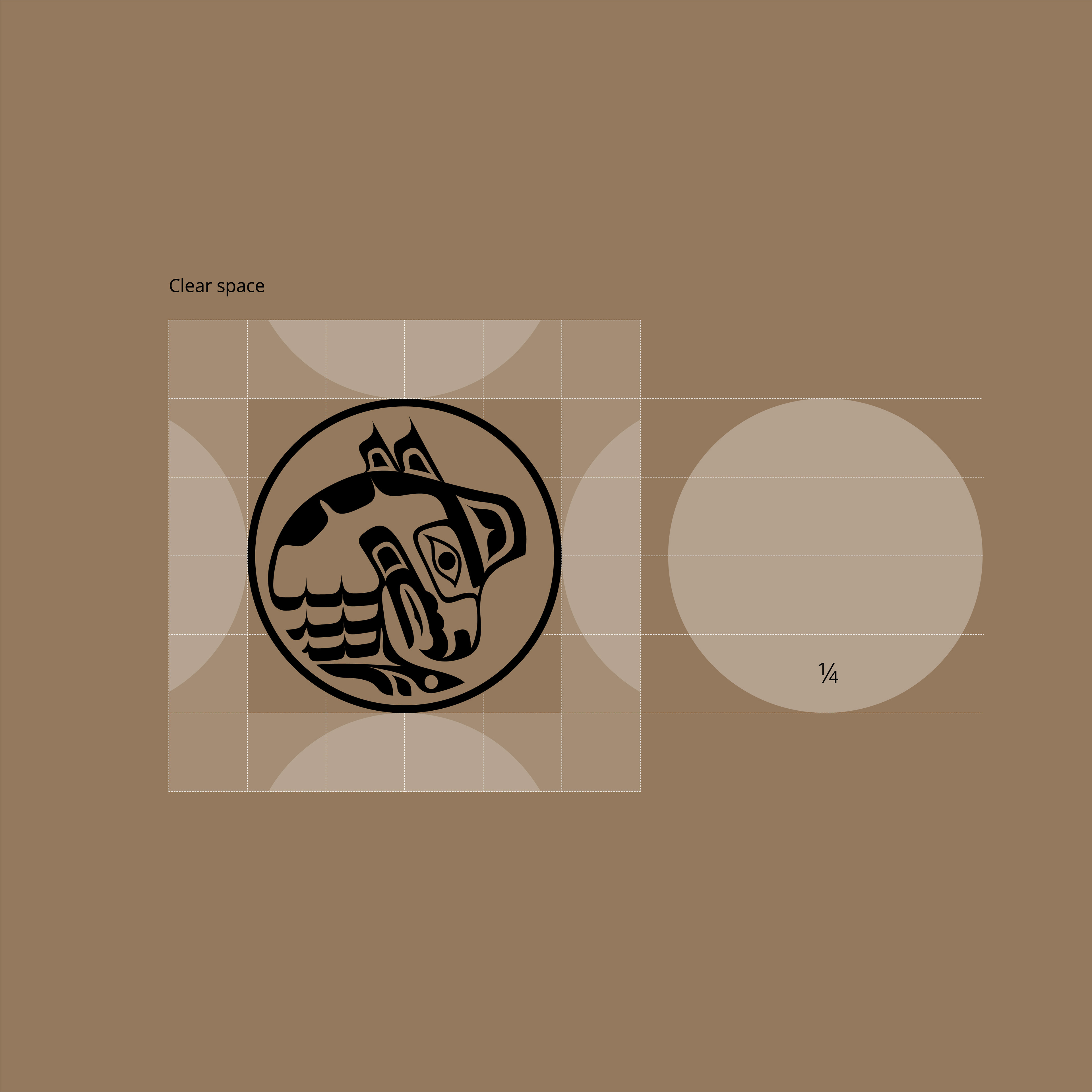
Discovering that circles and circular forms are very much a part of Coast Salish design, the shape with its 1:1 aspect ratio became a window within which to reframe the Thunderbird of the present day, and to reimagine possibilities for the future.
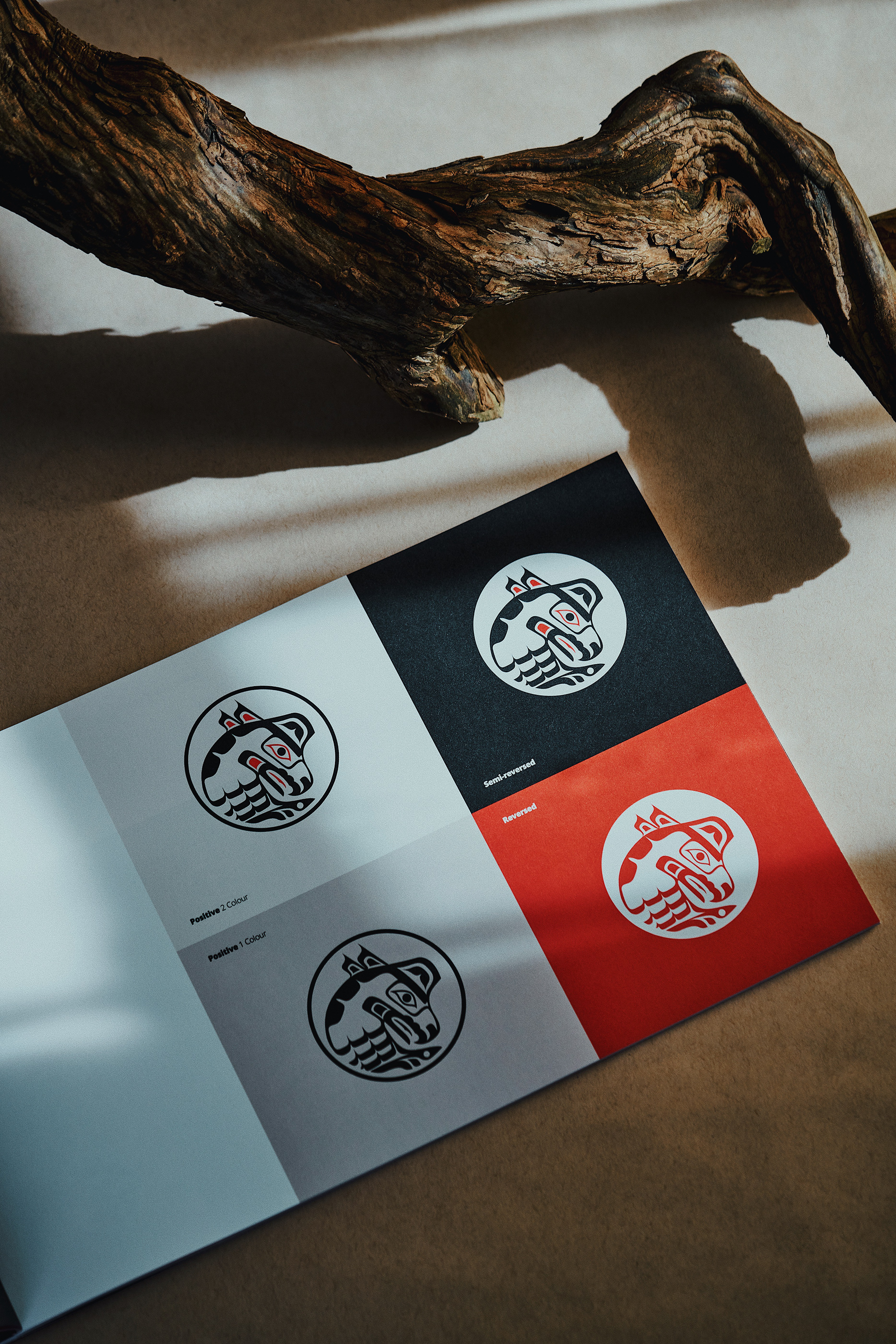
Ensuring the negative space around the head of the Thunderbird was optically balanced, a smaller concentric circle aligned to the head feathers was used as a guide to round-of the design within the frame. The crop resolves rescaling issues by significantly reducing detail. The resulting circular logomark works well as a stand-alone icon, and locks-up easily beside a wordmark.
DESIGN PROCESS: WORDMARK
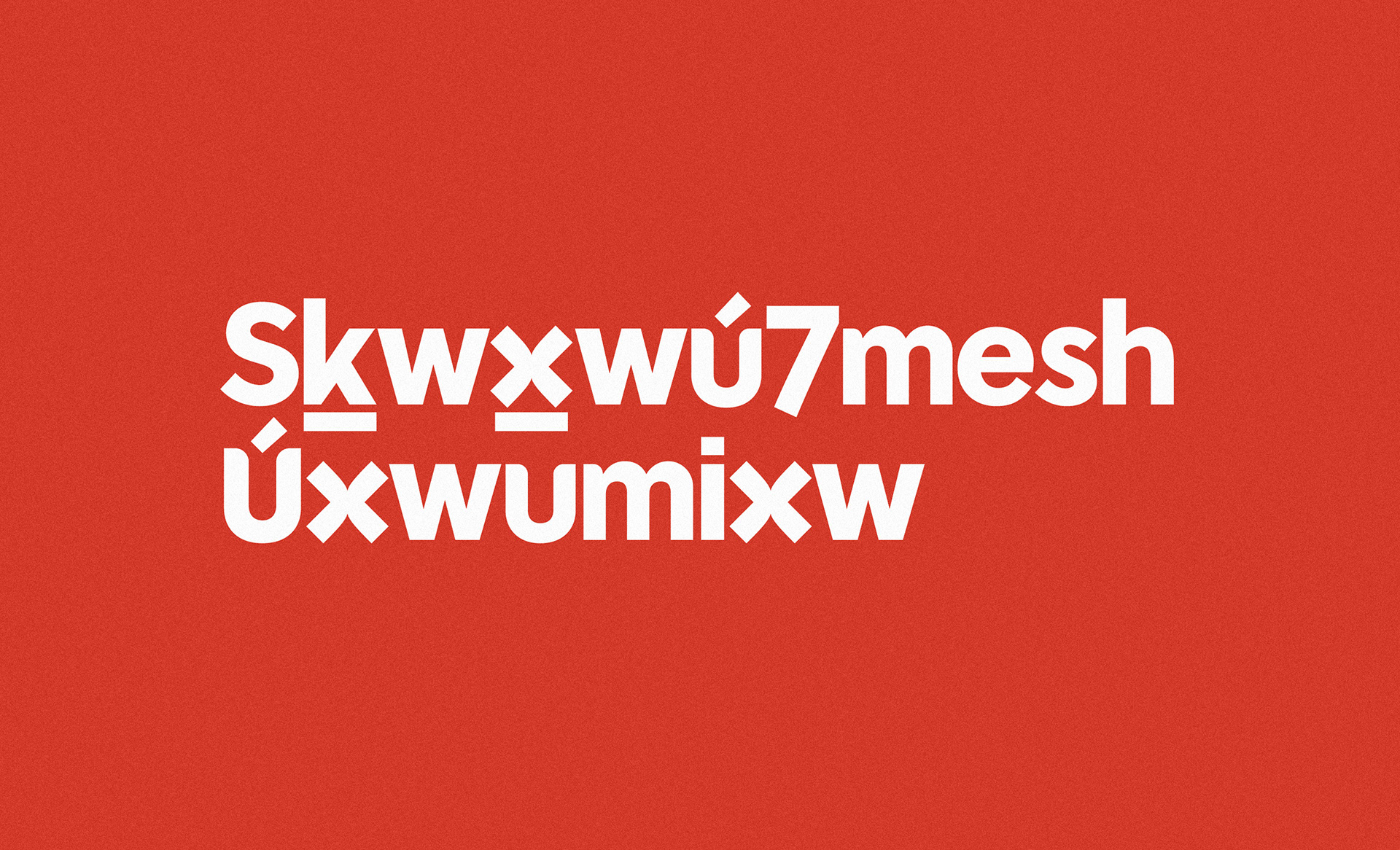
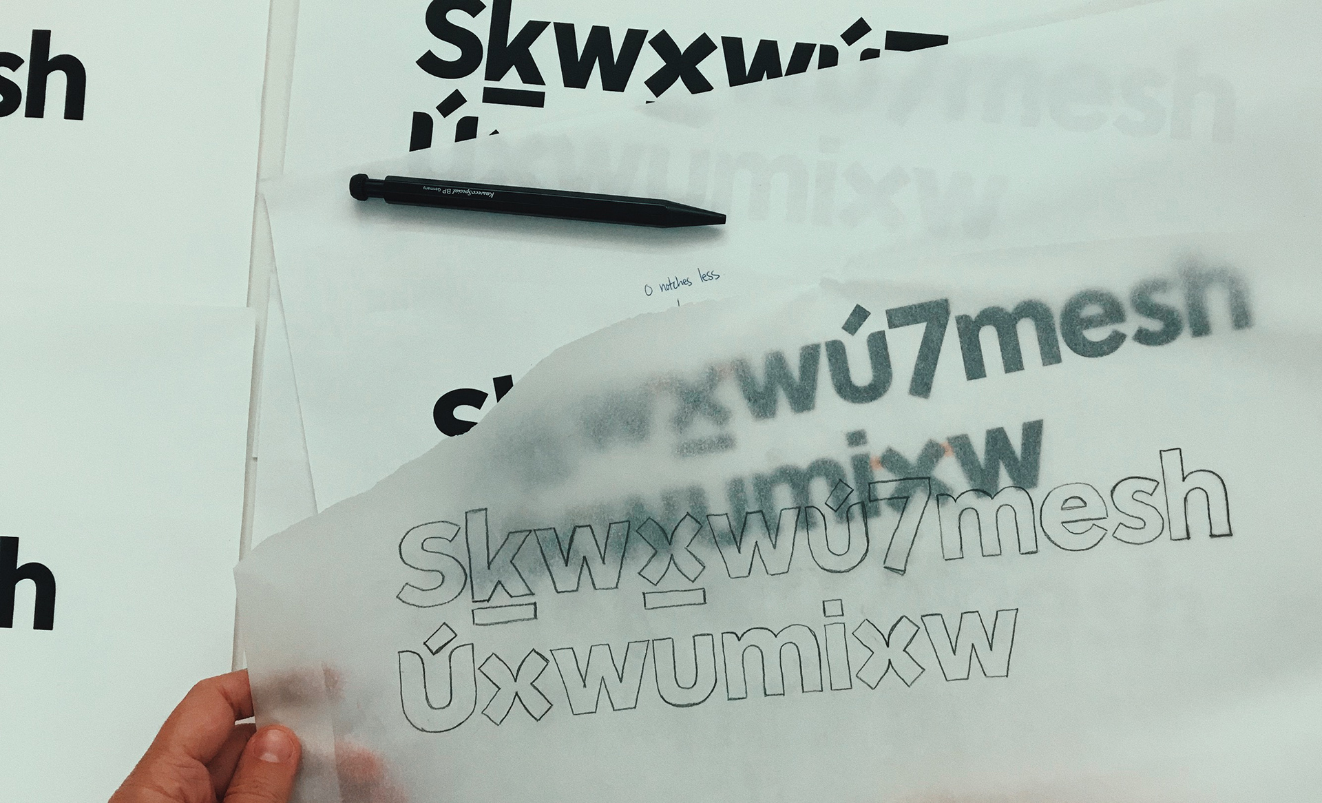
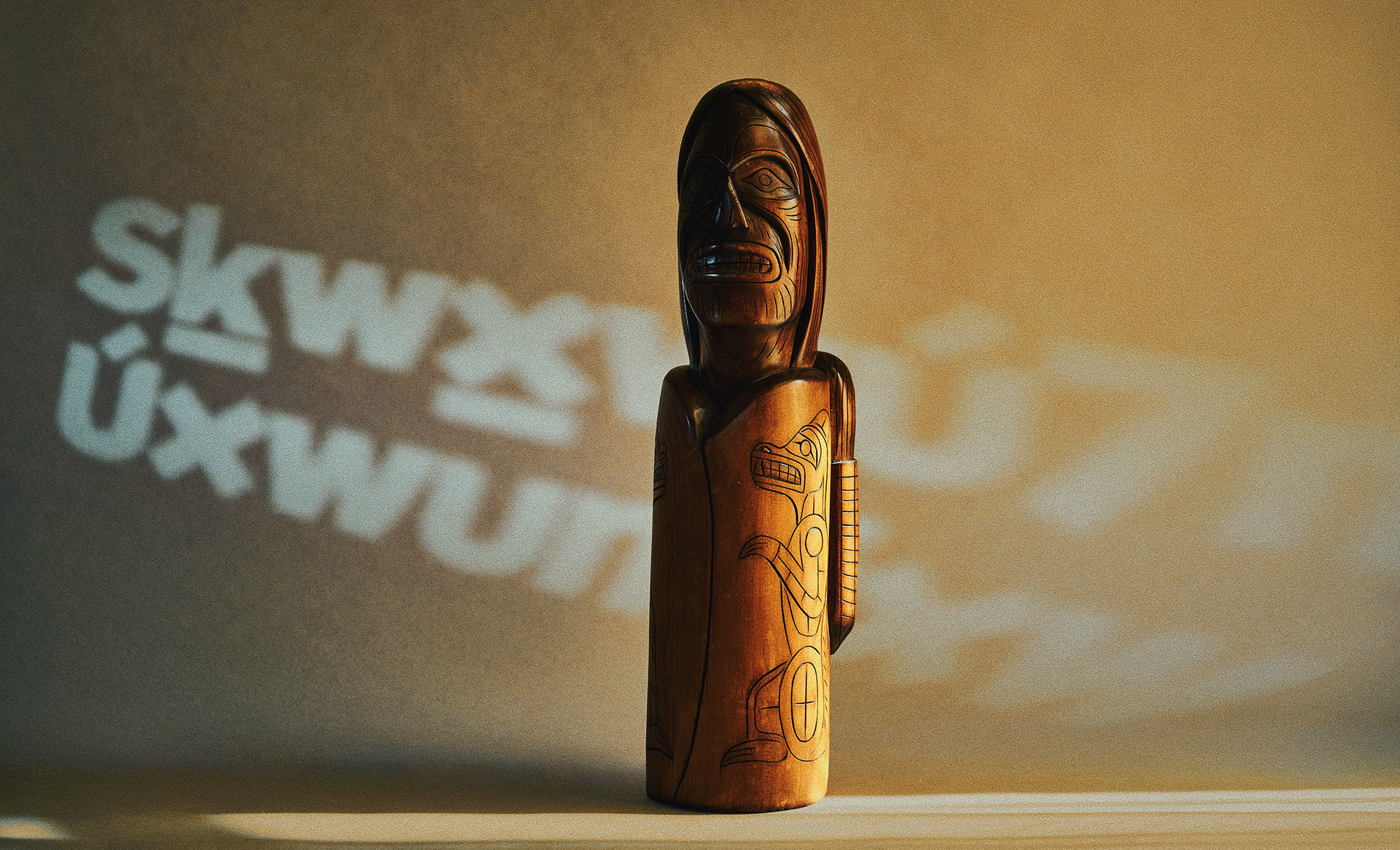
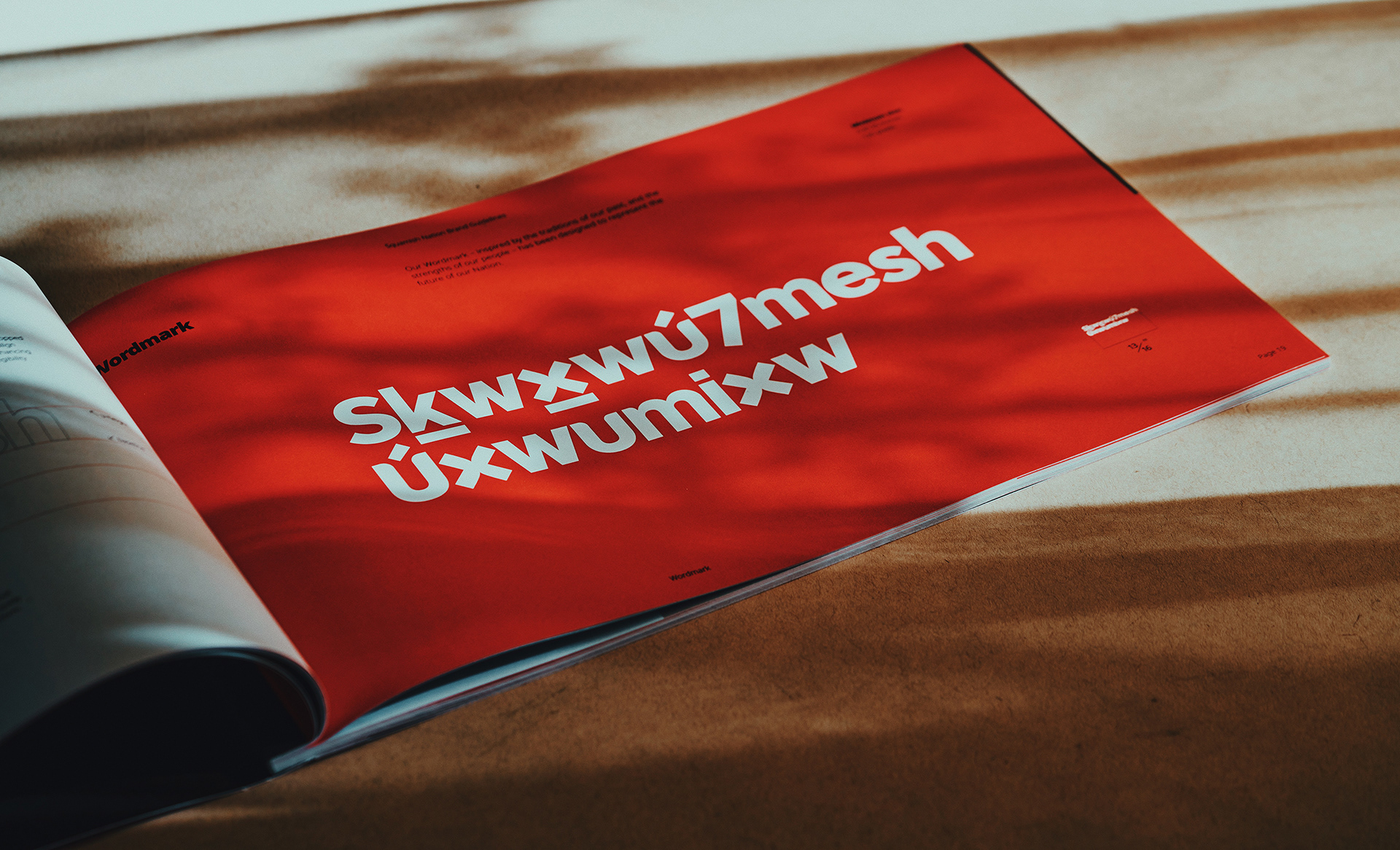
Title case was chosen to allow for better integration of the accents above and below the letterforms, creating a bold, warm, and rhythmic dance of shapes across the wordmark. The space surrounding each letterform was carefully considered to ensure the wordmark could be safely scaled down.
DESIGN PROCESS: LOCKUPS
The Thunderbird logomark and wordmark were designed with consideration of how the two come together to form a lockup. The English translation is placed below the wordmark to establish visual hierarchy and give prominence to the Sḵwx̱wú7mesh Sníchim (Squamish language), marking an important step towards language revitalization.
DESIGN PROCESS: LAYOUT
The identity was designed with flexibility in mind. On stationery, the components within the department lockups break apart proportionately and anchor to the document's corners. The position of these elements define an invisible grid upon which the document's content is aligned.
DESIGN PROCESS: COLOUR
The brand palette is inspired by the Nation's surroundings, traditions, craft, culture, and people. The primary colours, black and temlh (red ceremonial face paint), are accompanied by a range of complimentary tones and colours to reflect the warmth of the Nation.
DESIGN PROCESS: PATTERNS
As an extension of the brand elements, I used the brand palette to create a series of patterns inspired by Coast Salish craft to compliment the brand imagery.





A custom pattern created with the "x" from the wordmark.
DESIGN PROCESS: PHOTOGRAPHY
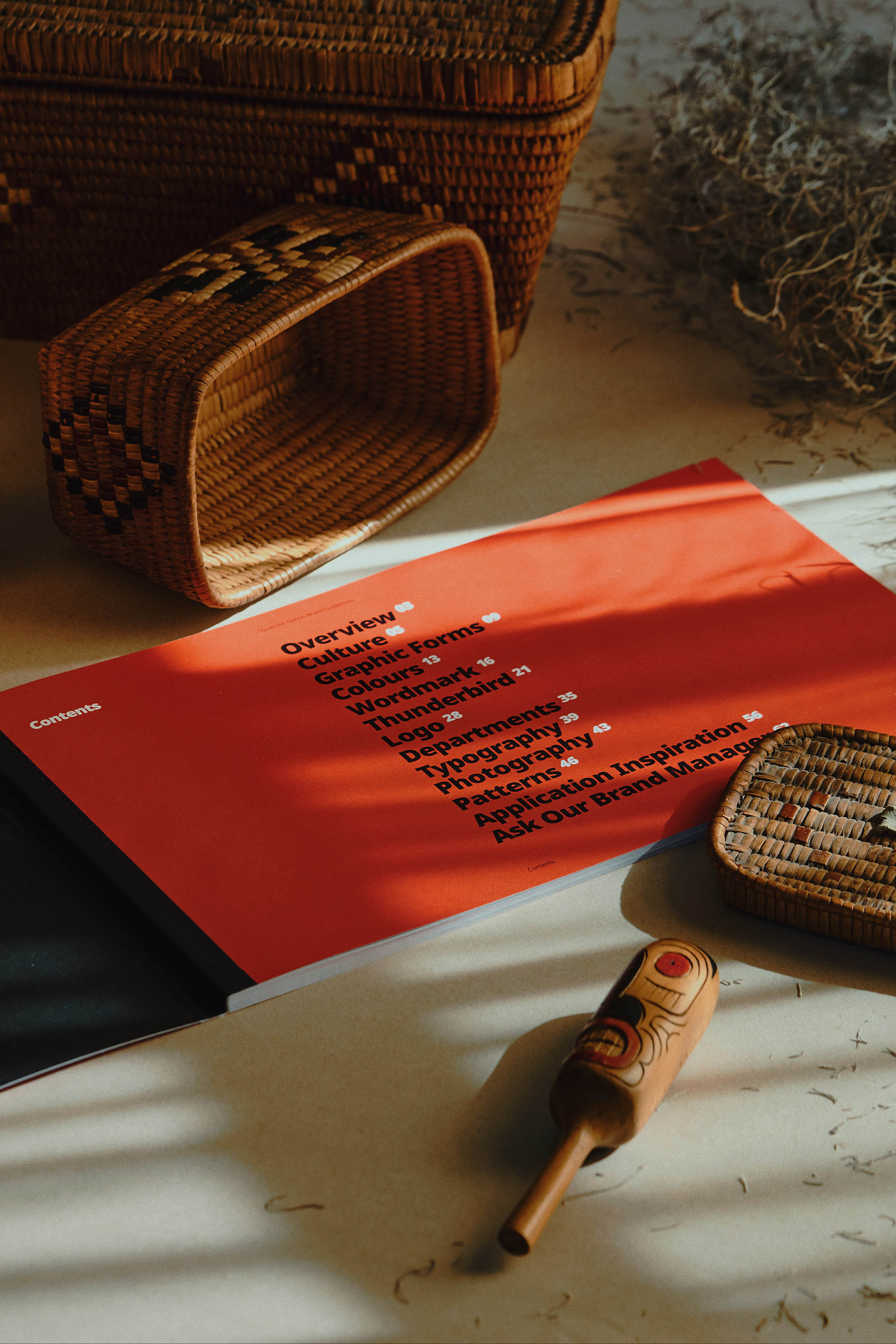
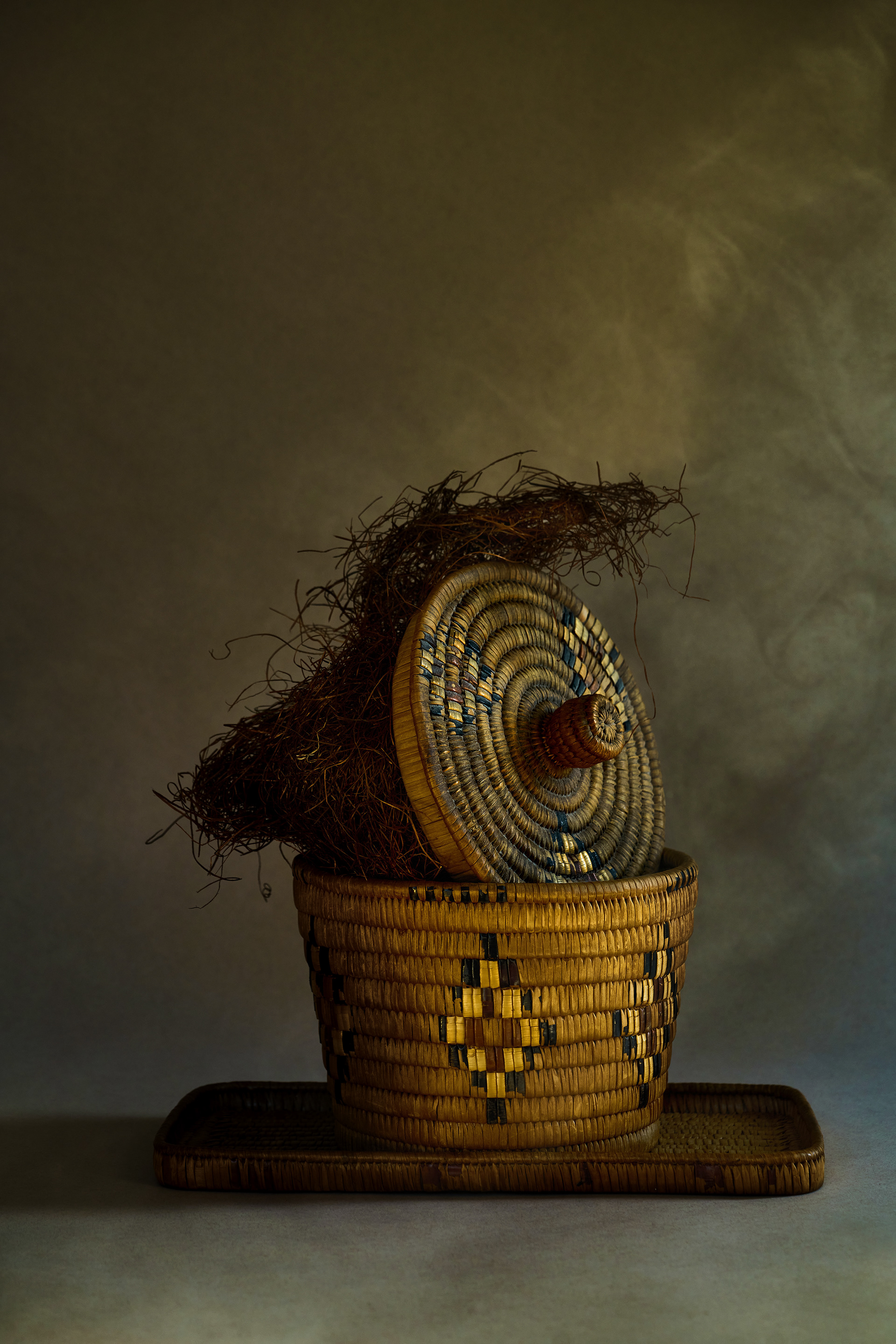
The project scope didn't include shoot direction, but as a part of the brand guidelines, a photographic moodboard was provided to help guide the curation of imagery in the future.
Understanding that a professional photographer will not always be possible, a set of Photoshop Gradient Map filters were provided together with the brand assets. This duotone effect enabled casual snap-shot imagery to feel more on-brand.
DESIGN PROCESS: TYPOGRAPHY
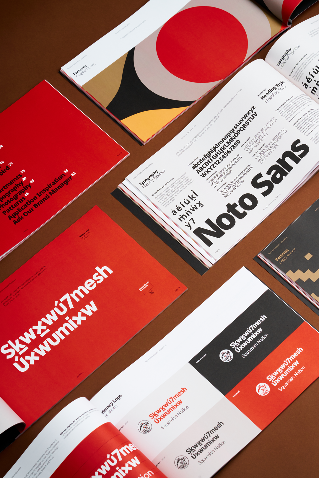
Noto Sans was selected as the primary brand typeface for its bold, graphic aesthetic. It is also an open source typographic family, suitable for print and digital applications, and covers more than 800 languages. Since Noto Sans requires glyph customization for typesetting Sḵwx̱wú7mesh Sníchim (Squamish language), it is only suitable for applications such as headings or stationery where copy is light.
When typesetting blocks of text in Sḵwx̱wú7mesh Sníchim it imperative that all diacritics and characters display accurately across all platforms and programs. Tahoma was selected as the universal brand typeface for two main reasons: it's a universal (“web safe”) typeface that displays correctly on all operating systems and all browsers. It is also a system font making it readily available.
Design-specific typeface for printed collateral
Universal typeface for body copy, documents, emails

CONTRIBUTORS
Project completed while employed at hcma.ca
Concept Design + Creative Direction
Nicole Bonnie Retief
Photography
Gabriel Cabrera
Photography Styling
Carl Ostberg
Photography Art Direction
Nicole Bonnie Retief
